Feedback Form Enhancements
Make providing feedback easy
Background
The previous feedback form was very complicated and laden with usability issues, making it very frustrating to fill out. This is made worse especially if customers are writing in to complain about an unpleasant experience. As a result, some customers chose to write in to various singaporeair.com email addresses that they can find, where some of them are unmanned mailboxes. This broken feedback loop led to further dissatisfaction of the customers.
Objective
Relook at the feedback loop and redesign the feedback form so that users can provide feedback to Singapore Airlines easily.
My role
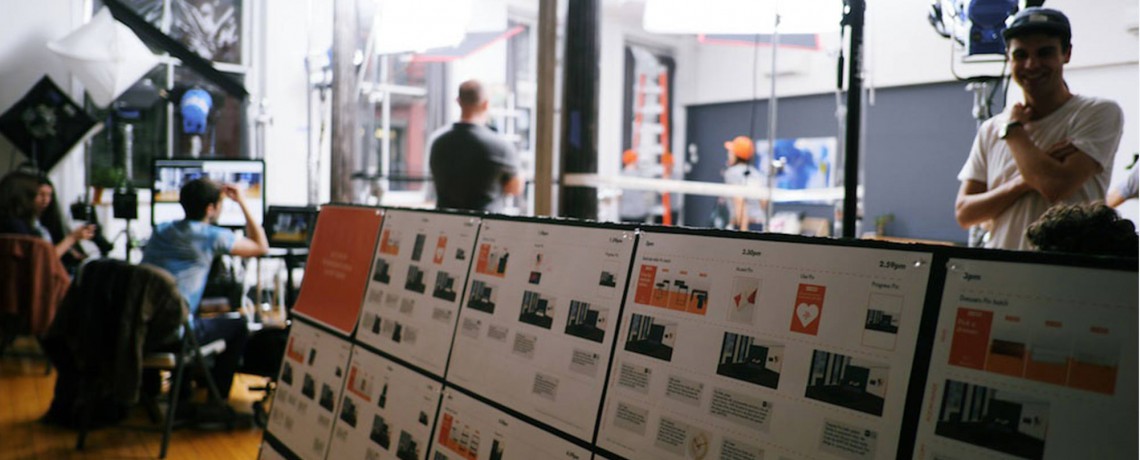
I led the UX part of this project with the support from 1 UX strategist and 2 UI designers. I started this project by talking to stakeholders from multiple departments to understand their backend processes in handling feedback and questions, and through those conversations, I also got further insights on how customers are providing feedback, and the nature of the feedback.
I then performed an audit to identify gaps and pain points of the existing feedback experience. During the entire design process, I worked closely with the stakeholders and developers to ensure that the proposal meets the business needs and is feasible in terms of build. I also led the user testing part of this project to uncover problems with our initial designs.
The challenges
Balancing and accounting for the different needs of multiple departments in a single cohesive design proposal
Third-party technical limitations hinder features that will speed up the feedback process, i.e. pre-filling of flight information
Project details
Audit of the existing feedback experience
I started the project by looking at the flow a customer has to go though in order to provide feedback. As part of the audit, I looked at the discoverability of the form on the site, the process of filling out the form and submitting the form.
1. Poor discoverability of the feedback form
The feedback form can only be accessed via the footer of the site, which makes it rather hard to find.
2. Type of feedback options are unclear
Feedback (Compliment, Concern, Suggestion) and help (Question) options are mixed together in one form, making it confusing for users.
“Concern” is ambiguous and unclear for users who want to make a complaint.
3. Multiple layers of categories and sub-categories
With a total of more than 50 categories and sub-categories to choose from under different categories, there is a huge cognitive load for the users to select the appropriate option before they can even start providing feedback
4. ‘Details’ section with multiple problems
A few types of information are required, such as personal details, booking details and the actual feedback. The lack of visual chunking on the form makes it hard for users to parse and fill out
Since it is possible to fill out this form on behalf of someone, it wasn’t clear whose personal details to provide here
Showing the optional flight details fields might cause additional load to users if their feedback is not flight related
Users can only provide flight details of one flight
5. Lack of email to confirm submission
User were presented only with a feedback submitted confirmation screen, but do not receive an acknowledgment email regarding the details of their feedback submission. Hence, there’s no point of reference should they require it later.
An overview of the old feedback form:
Insights
Some of the insights that I’ve gathered from the clients during the project are:
Users sometimes did not select the correct feedback type (Compliment, Concern, Question, Suggestion)
Flight details fields are optional because not all feedback is flight related. However, for feedback that are flight related, the flight details are sometimes incomplete and causes delays in servicing
Users often submit feedback that contains a mix of compliments, complaints and suggestions
Due to the limitation of 4,000 characters in the description area, users who need to type more will upload a Word file containing their feedback as an attachment
Users who called in to follow up regarding a feedback that they gave did not have a reference to their submitted feedback.
Solutioning & design considerations
Equipped with a thorough understanding of the usability problems and gaps, I approached the redesign by first looking at the various components of the existing feedback form and attempt to improve and simplify them:
Type of feedback (Compliment, Concern, Suggestion, Question)
Since ‘Question’ is not a feedback but more of ‘Help’, this option has to be removed from the feedback form
‘Concern’ was changed to ‘Complaint’ to make it easier for users to understand
Since users are giving mixed-bag feedback, our design needs to cater for their behaviour, and allow them to select more than one type of feedback.
Category of feedback (All the categories that routes the feedback to different departments)
I looked at the routing rules and figured out that a lot of the information needed could be inferred from the input of the users. For example, ‘Before your flight’ or ‘After your flight’ can be determined by comparing the date of travel with the date of submission.
Personal details (Title, First & last name, KrisFlyer Number)
Clear guidance is required to tell the user whose personal details to enter here, especially when the user is writing in on behalf of another person.
This section should be grouped together with the contact details section because they are from the same category
Flight details (Booking reference, Flight number, Origin, Destination, Date of travel, Cabin class)
Allow easy retrieval of past and upcoming flights for logged in users
Only show flight related fields when necessary
Allow the users to add more than one flight
Actual feedback
Increase the character limit so that users have more room to describe their feedback
Contact details (Email, Country of residence)
This section should be grouped together with the personal details section
Remove unnecessary fields (i.e. Confirm email address)
Attachments
Allow users to drag and drop the files to upload
Improve clarity of upload status and errors
Design iterations
Version 1

Version 2

Version 3

Version 4

The Launch
The new feedback form was launched in early 2020.
1. Entry points
The entry points to the ‘Help’ and ‘Feedback’ forms are separated
Additional entry points are added on the navigation bar for easy access.
New ‘help’ and ‘feedback’ entry points on the navigation bar
Separate ‘feedback’ entry point on the footer
2. Feedback form landing page
Users are encouraged to log in to their KrisFlyer account so that information can be populated from their account
Users will need to choose if they are providing a feedback about an experience they had, or a feedback regarding KrisFlyer / PPS Club (as these 2 topics are handled by different departments)
‘Useful links’ section was added to direct users to the correct pages to cater for users that are used to the old ‘Feedback form’ where they can seek help too
3. Select booking
Users are shown 3 of their most recent bookings. They can view more bookings, or enter flight details manually.
If the feedback is not related to a booking, users can skip this step by selecting ‘My feedback is not related to a flight booking’
4. Select flights
After expanding a booking, users are presented with all the flight segments in the booking
They can select all related flights that they want to give feedback about by simply checking them
5. More flights lightbox
If the bookings presented are not what users are looking for, they can browse more past or upcoming bookings in this lightbox
After selecting a booking, they can then select the relevant flights
6. Manual flight details entry
Users can enter their flight details manually if their booking is not found from the account retrieval
Users can add more than 1 flight
7. Feedback, personal and contact details, attachments
Compliment, complain and suggestion options are presented as multi-select options
Users can give a detailed description of their feedback in the text area
Included a checkbox for users to indicate that they are submitting this feedback on behalf of someone else, so that we can display the appropriate fields
Personal and contact details group together
Redesigned the attachments component to allow for drag & drop to upload

If users selected ‘Suggestion’, they will be given the option if they want a reply from Singapore Airlines. This gives users the choice, while also helps the customer support team in managing their replies
In the event that users checks the 3rd party submission checkbox, there will be further instructions for them to complete the necessary documentations. The fields will also change to provide better clarity.

8. Submission confirmation screen
After successful submission, users are able to download the details of their entire submission as a PDF for reference. (The original proposal of sending an email with the same details was not feasible due to backend limitations)

Submission confirmation screen
Check out the feedback form on the live site:
Express Booking
One step flight booking
Background
The existing 5-step flight booking flow, while allowing customers to fully customise their booking, is a hassle for frequent fliers as they have to select the same options repeatedly to book the flights that they always fly on. This led to the need of a more streamlined booking process for frequent fliers to book easier and faster.
My role
I was responsible for leading the UX of this project, working together with another UX strategist and 2 UI designers. The activities I covered include coming up with the initial concept, performing user and desktop research and working out the mechanics of the new booking flow. I collaborated closely with the stakeholders to understand the business priorities as well as the developers to understand the technical limitations that I will need to design around. Besides that, I also led the user testing part of this project, from planning to facilitating as well as analysing and presenting the findings.
After the design tweaks, this project was then handed over to the in-house UX team and I transitioned into a supporting role to provide feedback on the subsequent design changes.
The challenges
Design a booking experience that strikes a good balance between simplicity and flexibility. We want to avoid overwhelming users with too many unnecessary options, but still want to provide some extent of flexibility
Convince stakeholders to agree to the removal of some ancillary offerings in the new booking flow
To understand and design around the technical constrains that might affect the booking experience
Project details
User research
We began by trying to understand which factors (fare, ticket flexibility, seats) are more important to our frequent flier members when it comes to booking a flight. To find out, we ran an online survey with over 2,000 frequent flier members that do repeat travels to the same destination(s).
From the findings, we found out that getting a low fare is the most important, followed by seat preferences, ticket flexibility and upgradability. We also noticed that all the ancillary products such as additional baggage, Wi-Fi, hotels, cars and travel insurance are rarely considered during the booking process.
Wireframing and testing
With that understanding, I reduced the options from our existing booking flow to the most essential ones. After multiple iterations of wireframing the new booking flow, we put it in front of our users to see what they think.
V1 wireframes - Used for user testing
We initially tested a version where users needed to go though an initial set up flow to save their credit card details (for faster payment) and set up their travel profiles based on flight timings and seats preferences. They will then apply a selected profile when they start booking and the system will then make selections based on the presets of the profile.
Observations on the set up steps:
Most users understood the travel profile set up step
A few users felt uncomfortable with saving their credit card details before they make a booking
Some users stated that their preferred flight timing would differ depending on their destination. By pre-defining a specific flight timing per profile, that would mean they had to create multiple profiles
Observations on the booking flow:
Users have no issues enabling Express Booking and selecting a profile from the booking widget
Users were unsure of how to change their flights should the pre-selected ones were not suitable
Users mentioned that they would like to see the actual location of the pre-selected seats
All users said that they do not buy travel insurance from the airline because they are either covered by their workplace or they have an annual insurance plan
V2 wireframes
With the insight and feedback from the testing, I tweaked the designs by:
Removing the setup screens to lower the barrier of entry, so that users can start using the feature right away. Instead of depending the travel profiles that users have to setup, we use various data points to inform the pre-selections.
Allowing users to change the fare type right on the page
Making the alternate flight options more visible and easily accessible from the page itself, without having to go to another page
Displaying the seat location upfront
Grouping the passenger details section to make it easier to read
Remove the option to purchase travel insurance
The Launch
The Express Booking flow was launched as a beta feature on singaporeair.com.
By leveraging on the past booking data of our frequent flier members, we are able to pre-select options for them in the Express Booking flow while providing the flexibility for them to make any necessary changes.
With options pre-selected, passenger and payment details pre-populated, all the users have to do is to review the details and pay for their booking.

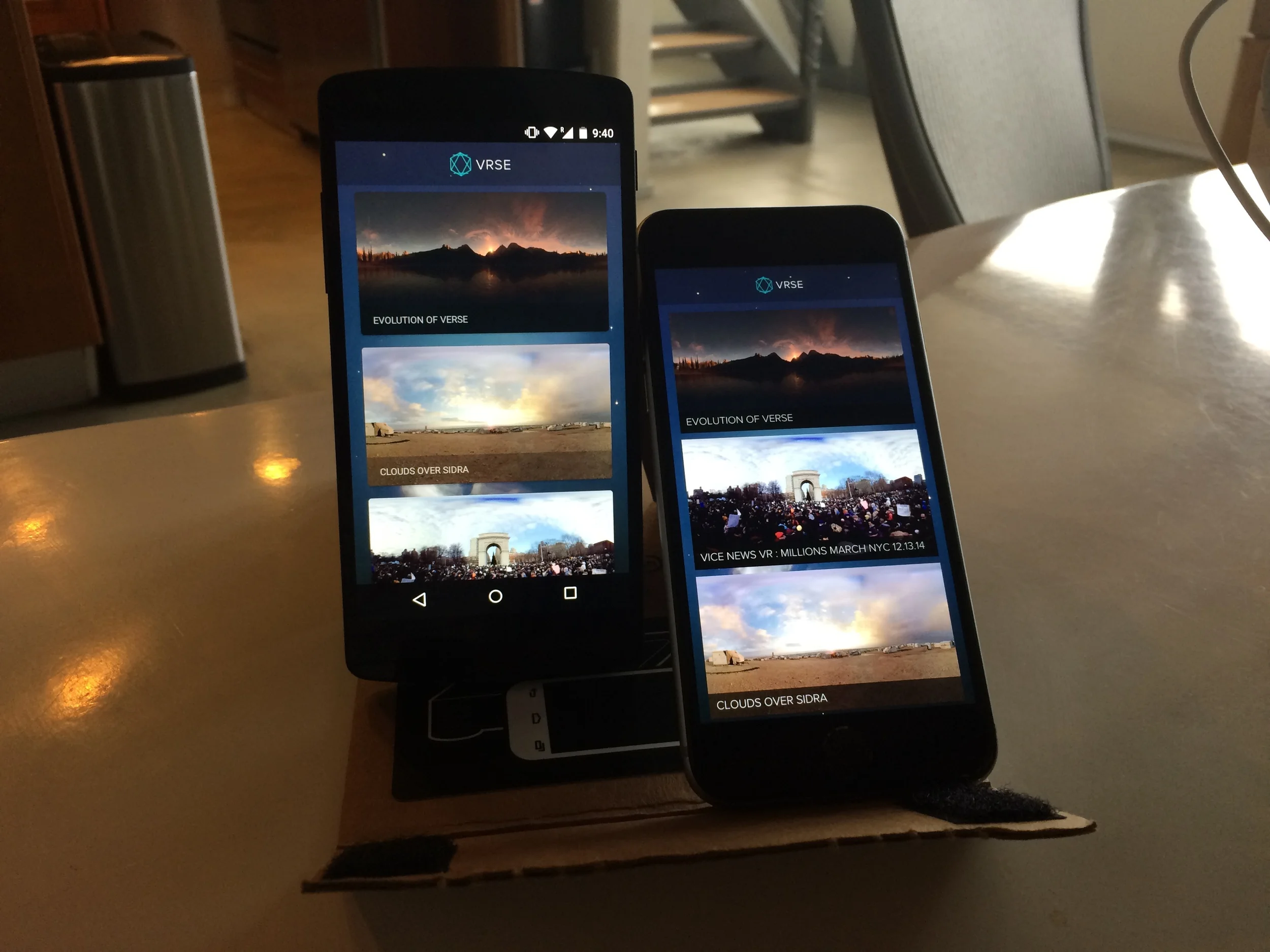
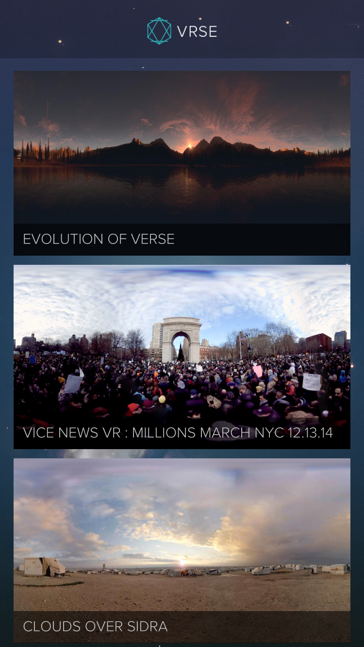
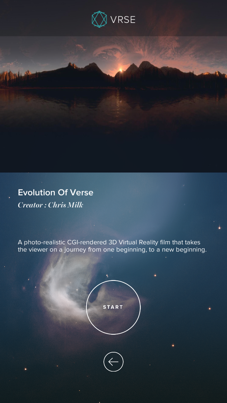
Within VR Mobile App (Previously known as VRSE)
Client: Within
Platform: iOS & Android App
My Role: UX Designer
Background
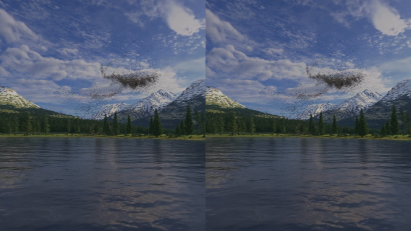
Within is a platform of Virtual Reality Experiences. Famous music video director, Chris Milk partnered with other world-known directors and created a series of VR films for Within. In conjunction with Sundance 2015, Within would like to let the mass public to experience VR for themselves, as there is no better way to describe how the experience would be than to experience it for yourself. Besides that, Within also wants to allow the rest who cannot make it to Sundance to be able to have that experience at the comfort of their home.
Objectives
Design a mobile app (iOS & Android) for the Within Virtual Reality experience. The app has to be simple to understand and let users fully immerse themselves in the virtual world with curated video content. The app will deliver a more engaging experience in VR mode, used together with a Google Cardboard, but should also work in a full-screen magic window mode for users that do not own a Cardboard.
Design Considerations
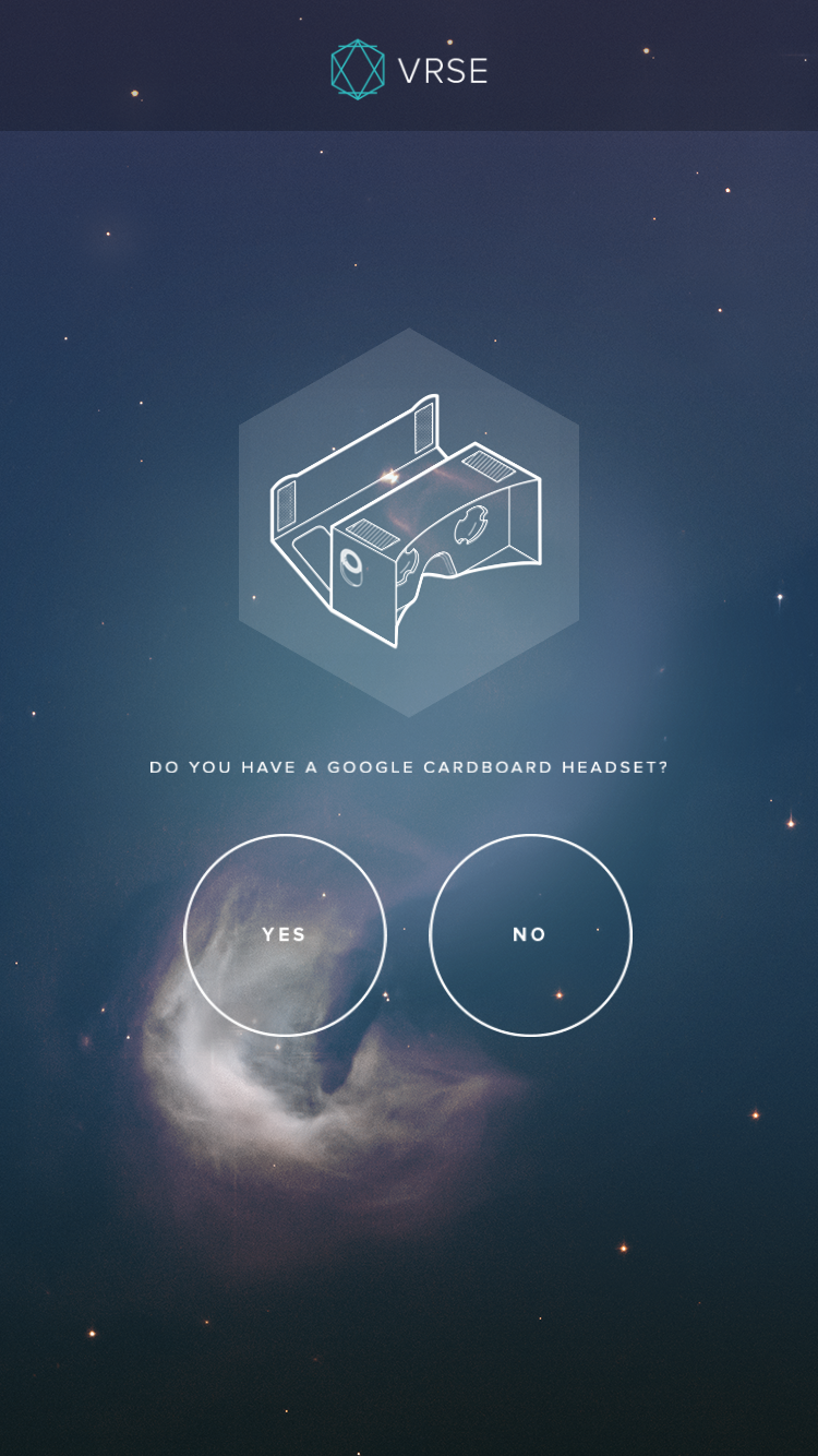
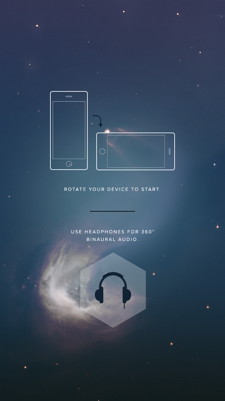
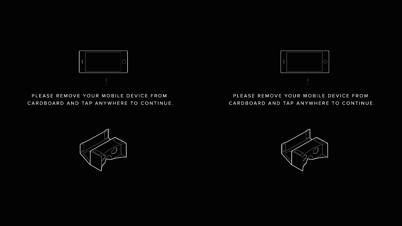
2 modes, VR and Magic Window
This app is mainly targeted at users with the Google Cardboard so that they can have the full VR experience. However, it should work for users without the Cardboard. Hence, the users will have the option to select if they have the Cardboard when they play a video, which will then decide if the full VR mode or the Magic Window mode that is served.
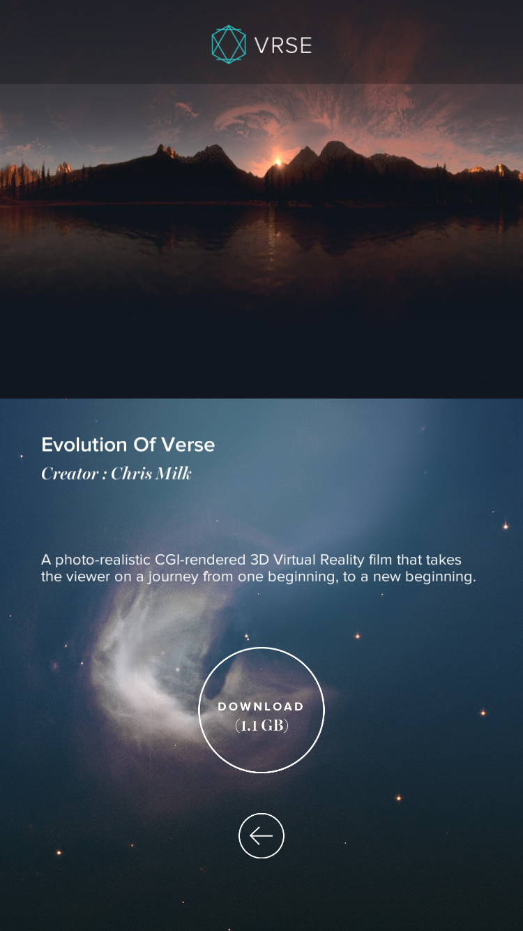
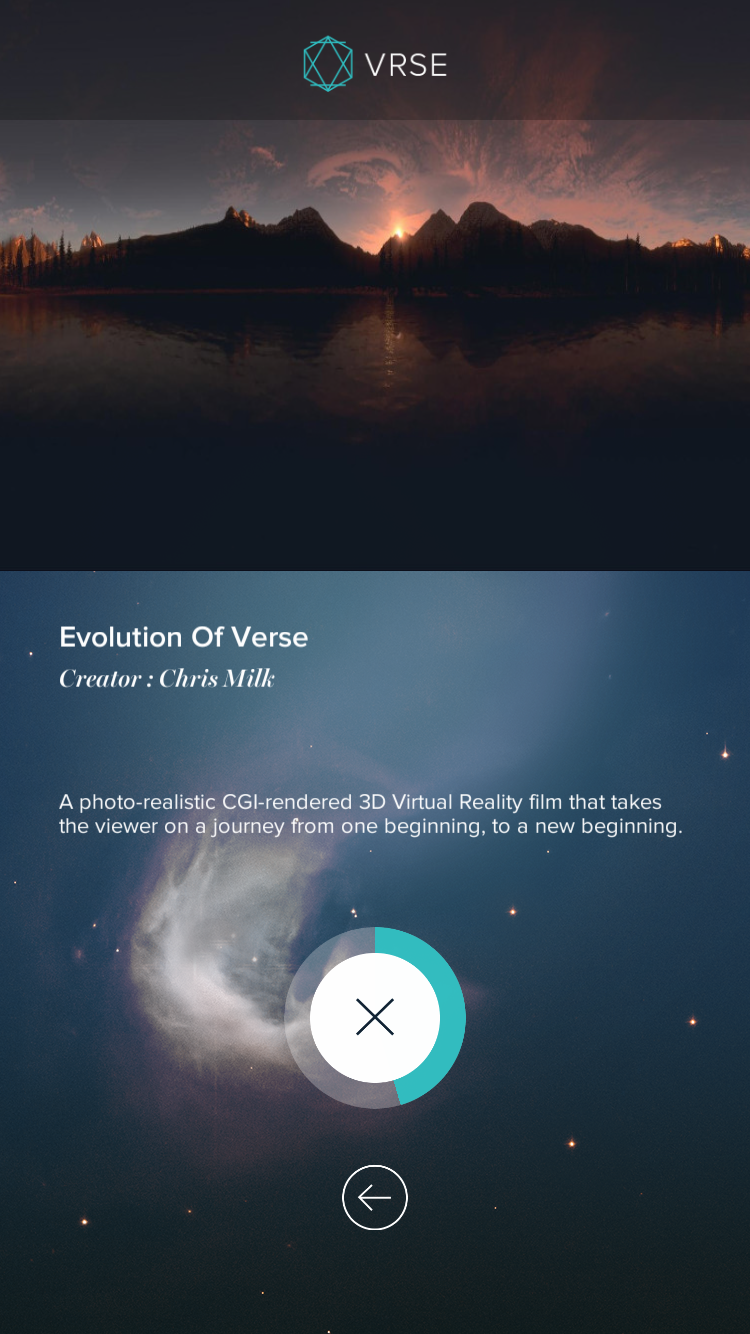
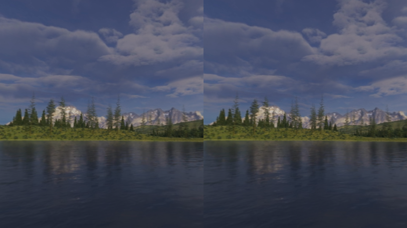
Video download and download over data connection message
Because VR videos are heavy in file size, the app will not come bundled with the video files to keep the app size to a minimum. This is to make sure that it does not exceed the app store limitation and can be downloaded over a wireless data connection. After the users downloaded the app, they have the option to download the individual videos. If users are not connected to a wifi network, a warning message will be shown to make sure the download of the video files will not use up their cellular data quota.
Back button
Back button moved to the centre bottom of the screen to allow easier reach and minimize finger stretch.


adidas #MiZXFlux Mobile App
Client: adidas
Platform: iOS & Android App
My Role: UX Designer
Awards: FWA Mobile Of The Day
Background
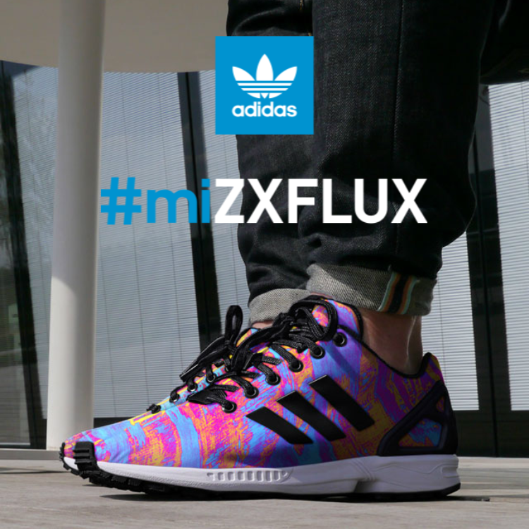
adidas’ customization line, miadidas is not well aligned and integrated into the adidas Originals campaigns. In order to reposition the miadidas line and reconnect to the consumers and also to set itself apart from other competitors, adidas is looking for an innovative way to let consumers customize their shoes.
Since the launch of the ZXFLUX line, adidas had a breakthrough in fabric printing technology that allows crisp and high quality images to be printed on the shoes’ upper. adidas decided to use this technology to let shoe lovers unleash their creativity by allowing them to design their very personal, one and only limited edition ZXFLUX. They could then purchase and wear them to show off their creations.
Objectives
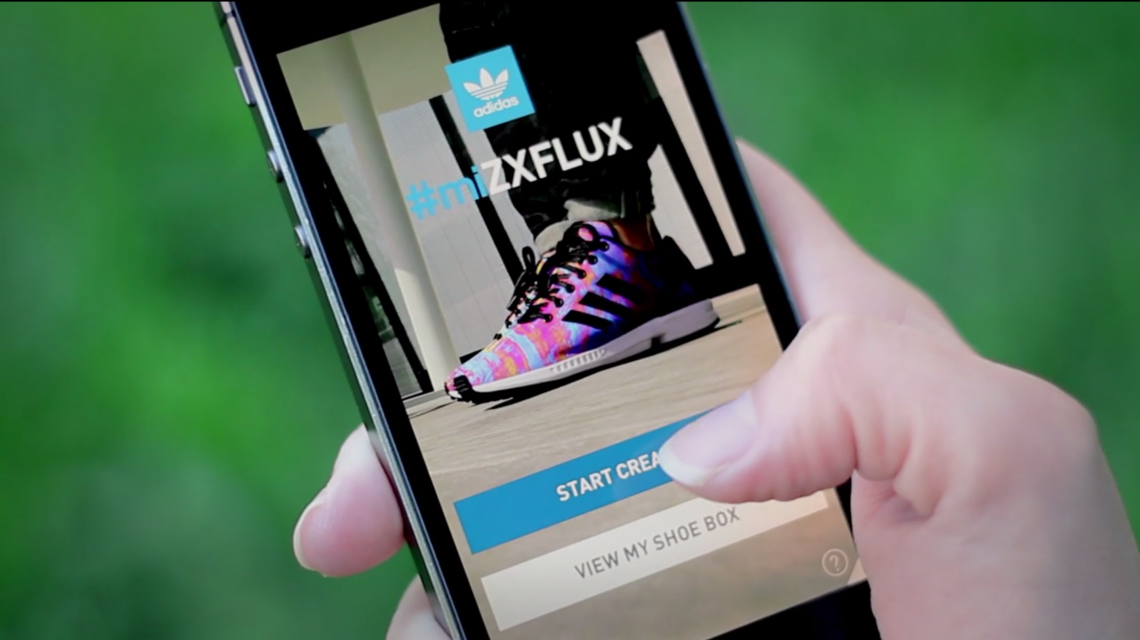
Build a simple mobile app to allow shoe lovers to design their own ZXFLUX by taking a photo and mapping it to the template of the shoe, preview every angle of the shoe in detail, share and purchase their creations.
Target Audience
The primary audience of the app is aged between 18 - 22 with a 50/50 gender split. This app is targeted to users who are expressive about who they are. They are not shy about any fashion type as long as it can showcase their personal style.
Responsibilities
Designed the user experience and user interactions for the iOS and Android app.
Created the user flow diagram to illustrate all user touch points and possible flows within the app.
Wireframed the app showing all different states as the users interact with it.
Determined the animations of different elements in the app to make it a delightful experience.
Provided different recommendations to the clients to meet their business needs, as well as keeping the app simple and easy to use.
Created interactive prototypes for presentations and testing.
Performed user testing of the app to surface design flaws that causes confusions.
Created multiple design iterations to improve on the design.
Deployment & Results
The launch of the app in Berlin created a huge buzz on social media. Sneaker and fashion lovers were very excited to try it out and create their very own #miZXFLUX. Users are sharing their own creations on social media such as Instagram and there are currently more than 20,000 posts with the hashtag #miZXFLUX.


APT CB2
Client: CB2
Platform: Web & Mobile Web
My Role: UX Designer
Awards: 2015 WEBBY AWARD WINNER (ADVERTISING AND MEDIA - RETAIL), FWA Site Of The Day
Background
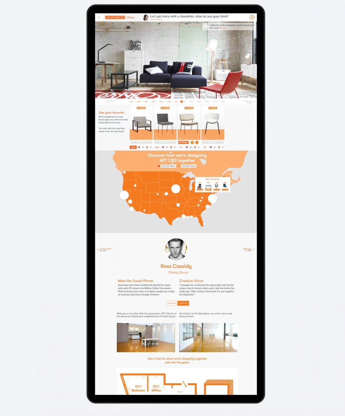
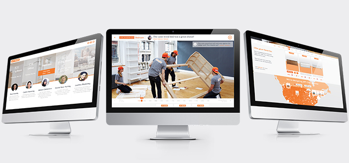
APT CB2 is the first real apartment designed live on Pinterest.
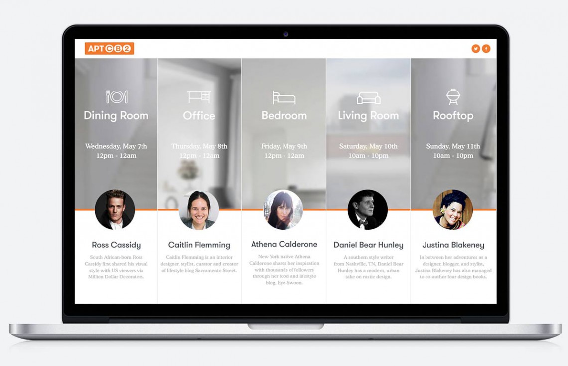
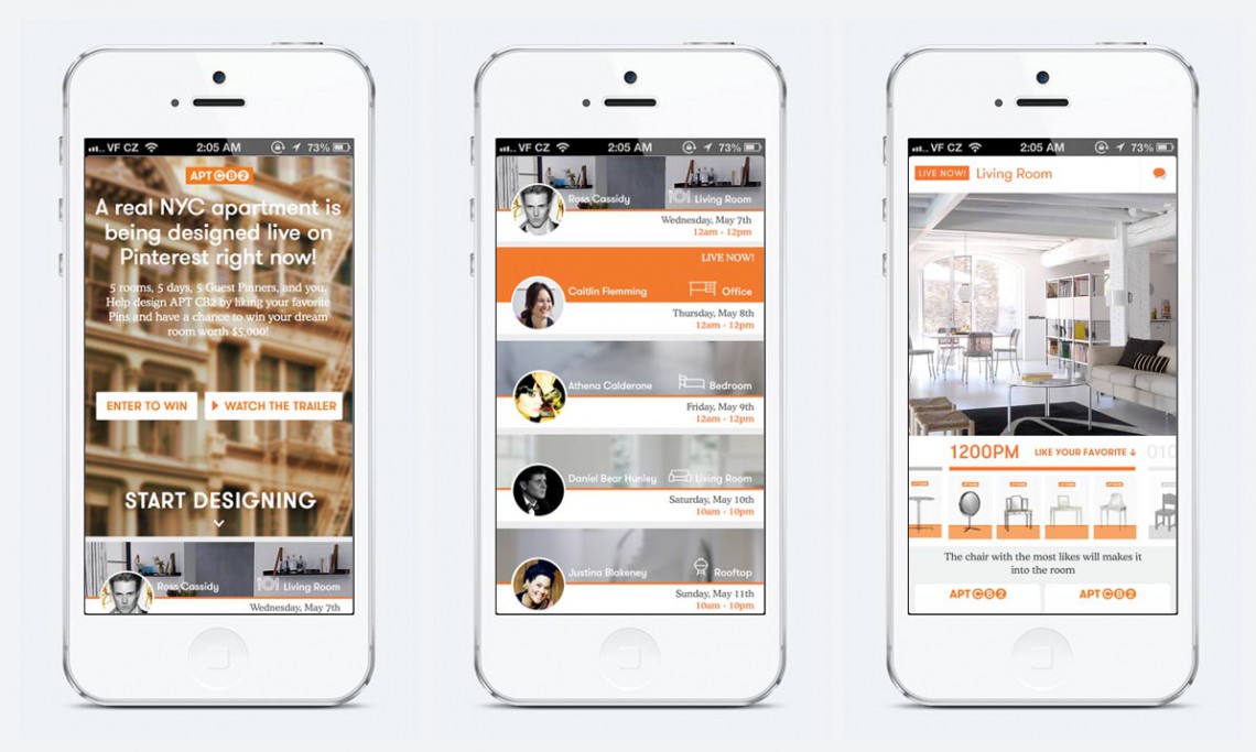
To broaden its fanbase, CB2, a modern furniture store, crowdsourced the live design of a Manhattan apartment using Pinterest. CB2 enlisted five popular Pinterest designers to style the empty space by selecting and “pinning” items from its store to the campaign’s board. Each designer worked a different room, and helped to select its content by voting for their favorite items. After voting, users could also enter a sweepstakes via Twitter or an online entry form to win their dream room worth $5,000.
Kicking off on May 7, 2014, the apartment was designed in real time. Designers were assigned a specific day, and for twelve hours that day, users voted on the designer’s top picks, either on the campaign’s microsite or on Pinterest. The winning items were featured in “APT CB2” for the week of the campaign and were revealed on the microsite. The campaign was promoted through a YouTube trailer, which could be shared on Facebook, Twitter and Instagram. The microsite was built with HTML5, and following the completion of the campaign, it showcased the design process from start to finish using time-lapse photography.
Objectives
Design a desktop and mobile site to allow users to vote on their favorite items every hour throughout the 5-day campaign. The site should clearly distinguish the different rooms on different days, so the users would know what room is currently being designed live. There will be a timeline to control the image sequence feed and it has to be intuitive enough for the users to know how to interact with it and scrub through the day and see how the room was designed piece by piece.
Responsibilities
Designed the user experience and user interactions for the desktop and mobile site.
Wireframed the design to establish a common understanding between designers, developers and the clients.
Made sure that navigation, voting and timeline scrubbing is simple to understand.
Provided recommendations to solve problems with very wide screens that do not display necessary elements on one screen.
Design Considerations
Pan device sideways to view room on mobile
In order to fit the image of the whole room into a portrait view of a mobile device, and not make it too small in favor of maintaining the aspect ratio, I decided to have the image extend beyond the width of the screen, and using the accelerometer and gyroscope in the device, allow the users to pan their devices sideways to view the whole room.
Screens with low viewport height
There were concerns about some screens with low viewport height that will not be able to display the whole image for the image feed without altering the aspect ratio. I recommended 2 solutions to tackle that problem as detailed in the last 2 pages of the wireframes.
i am @brazuca
Client: adidas
Platform: Web (YouTube Gadget)
My Role: UX Designer
Awards: FWA Site Of The Month
Background
Adidas is a major sponsor of the FIFA World Cup and also delivers the official match balls for the event. The design of the ball – dubbed Brazuca by the Brazilian public – was shown officially to the public on December 3rd 2013. The idea behind the campaign surrounding the release is to see the world from the perspective of the Brazuca, also reflected in the language in the campaign with taglines such as “I am Brazuca.”
The big challenge was to figure out how to experience what it might feel like, as a ball, to be played by world famous football players and regular kids alike. The idea is to let the user see the world from the perspective of the ball in an interactive 360 degree panorama.
Objectives
Design a custom 360˚ player that allows the user to change the camera angle and pan around the 360˚ video. The player has to clearly indicate the different parts of the video, the normal linear cut video and the interactive 360˚ video to the users. It also has to provide clear visual cues to prompt users to activate the 360˚ video. The interfaces and interactions has to be seamlessly designed so if the user does not interact with the player, they should be able to see the linear cut without interruption.
Responsibilities
Designed the user experience and user interactions for the 360 ̊ custom video player and also the linear cut custom video player.
Ensure that all hints and cues to the users are clearly and subtly stated to guide the users to operate the 360 ̊ video player.
Wireframed the player controls to show different states of user interactions.
Created the user flow diagram to map out all the possible flows in the experience.


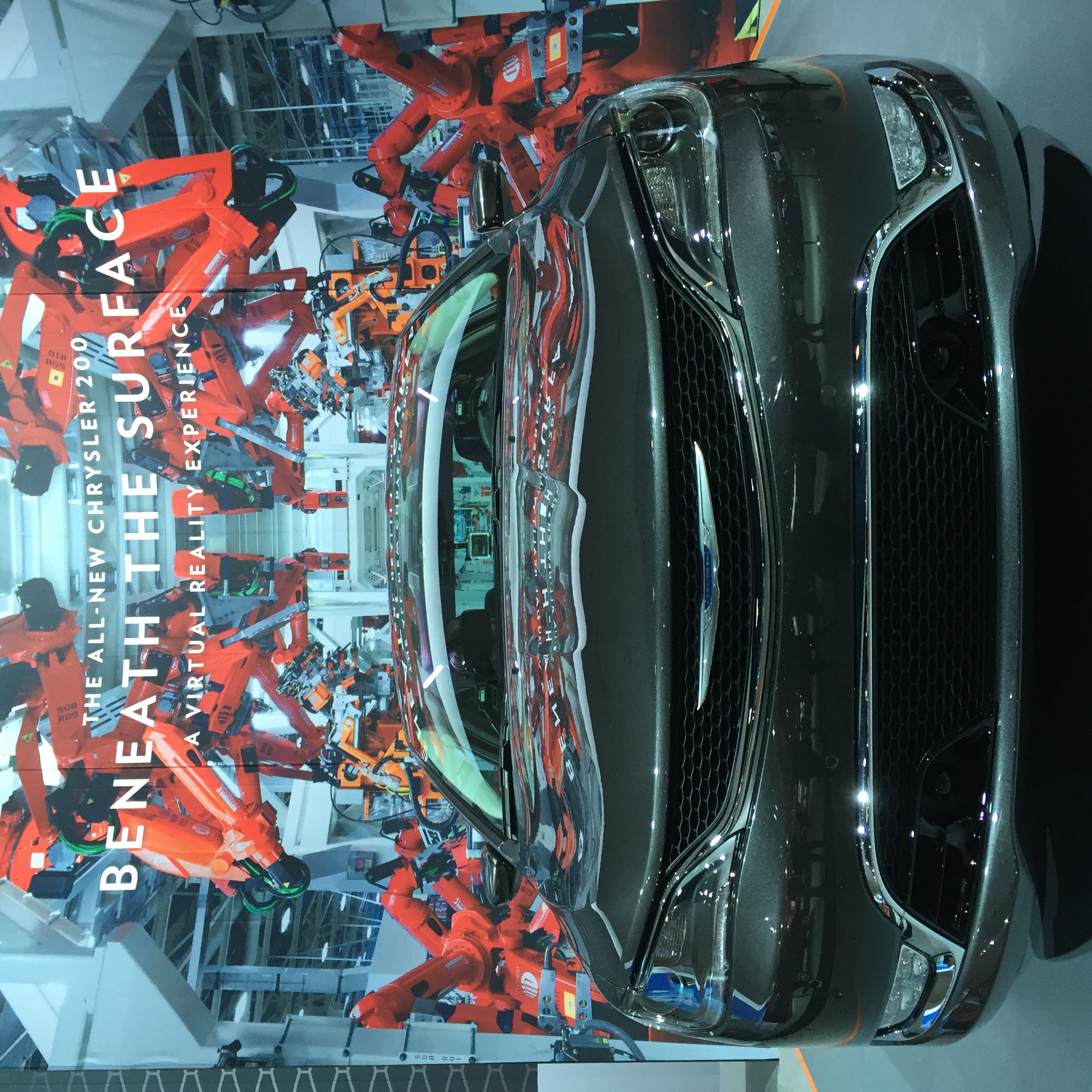
Chrysler 200 VR Experience
Client: Chrysler
Platform: Physical Installation
My Role: UX Designer, Equipment Setup and Configuration
Background
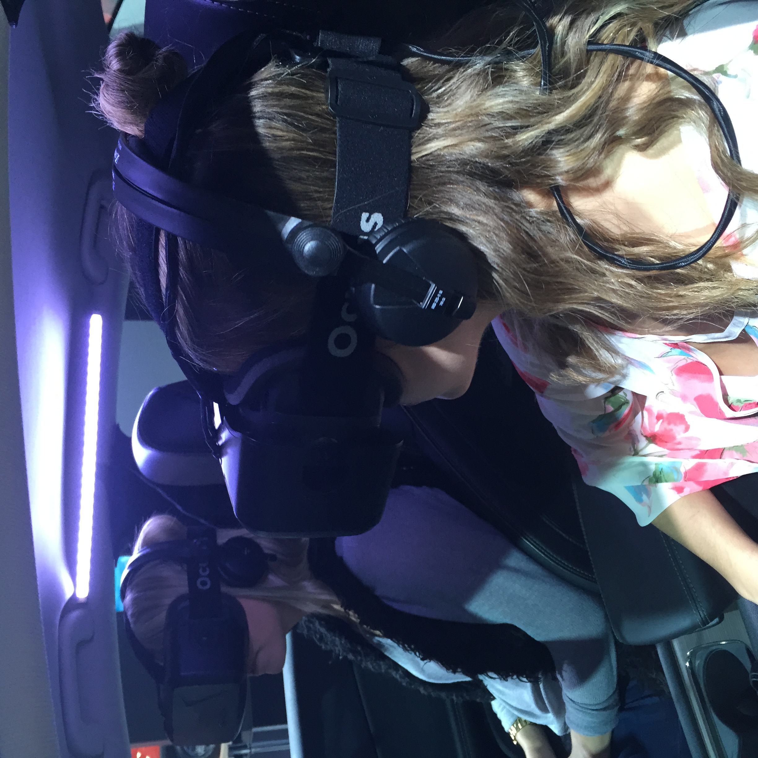
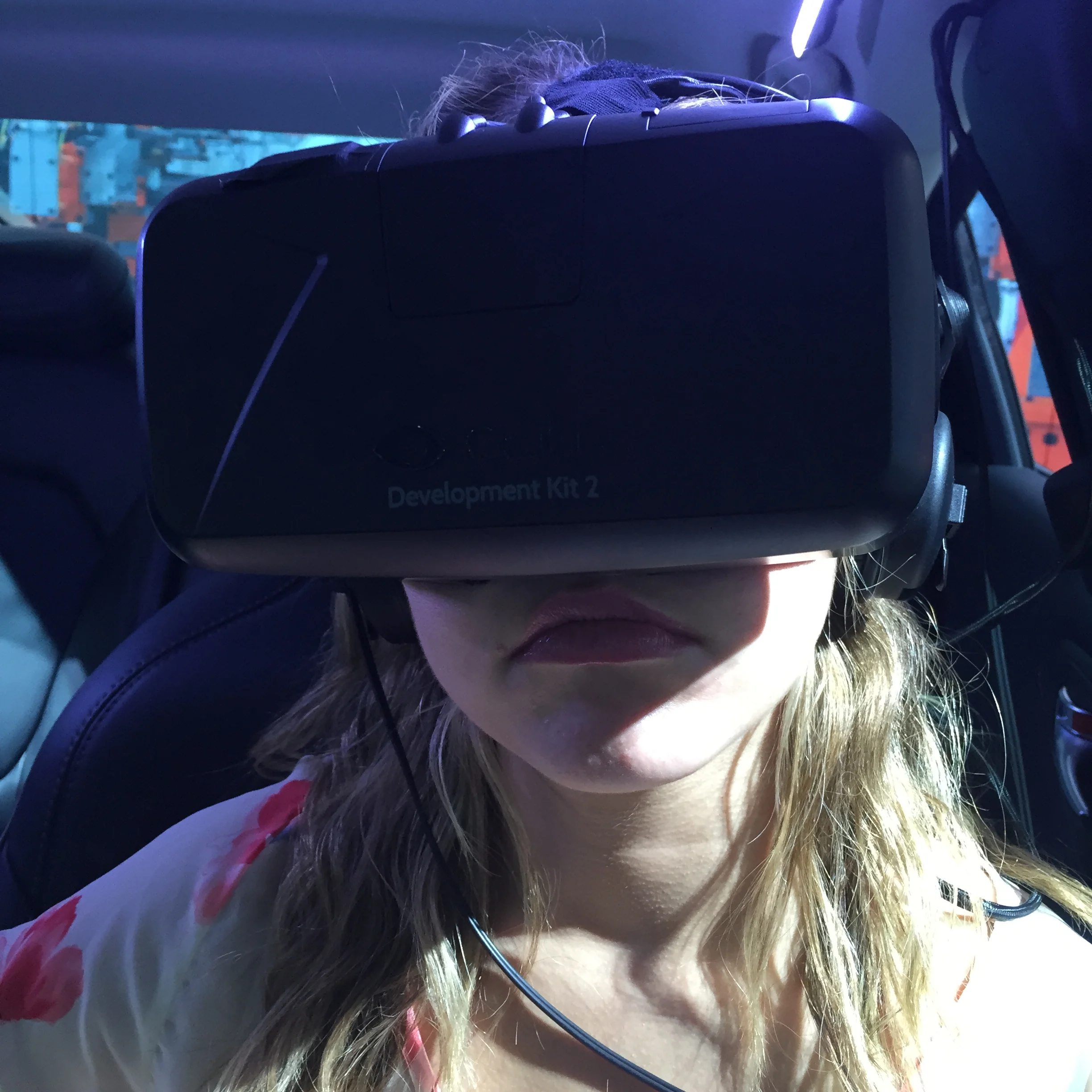
To promote the all new 2015 Chrysler 200, under the direction of the Chrysler brand, Wieden+Kennedy partnered with Stopp and MPC Creative to help deliver a first-of-its-kind interactive, photo-real virtual reality experience. ‘Beneath the Surface’ is a four-minute experiment in pushing the boundaries of what’s doable in virtual reality. Using the latest Oculus Rift DK2 headset, users are immersed in a beautiful rendering of the Chrysler 200 and taken on an audio-visual tour of the car and the state-of-the-art facilities that make such a vehicle possible.
The creative challenge was to maintain maximum visual quality while recreating the classic ‘exploded car’ that we’ve all seen in commercials. Together, Wieden+Kennedy, Stopp and MPC Creative, achieved this. The user can experience it first-hand as the car flies apart and encircles them, showing off the quality and craftsmanship of the vehicle. The user interacts with the car parts is in real-time and allows the viewer to cue additional immersive film content. The visual thrill ride is augmented by an explosive soundscape that literally shakes the car beneath the user.
Objectives
Design a unique experience to bring the users to the factory where the Chrysler 200 was built. The experience will let them learn about how the car was carefully manufactured to ensure the highest possible quality. The users must be able to select which of the short videos of the manufacturing process that they would like to watch and the interaction has to be easy enough to be understood for a wide variety of audiences.
Responsibilities
Helped design the interactions in VR mode where users do not have regular input devices like a mouse / keyboard. Users position an on-screen reticule on their selection to trigger a timer. Once the timer is up, the selection is executed.
Suggested the implementation of Buttkickers on the car seats that vibrates according to the video to enhance the VR experience.
Helped setup and troubleshoot all the equipment required to to ensure the VR experience runs smoothly so as to not cause nausea and motion sickness to the users due to possible lags and frame rate drops.
Designed a separate sign up page so that Chrysler gets consent from the public before they try out the experience, and also let them opt-in for newsletter about the new car.


Press
The experience debuted at the LA Auto Show in November 2014 and traveled to the CES 2015 in Las Vegas and the Detroit Auto Show in January 2015.
Fast Co.Create - Chrysler reveals the finer details of car production in virtual reality.
Agency Spy - W+K explores virtual reality for Chrysler.
Little Black Book - A virtual tour of Chrysler's factory with W+K's Oculus Rift Experience.