APT CB2
Client: CB2
Platform: Web & Mobile Web
My Role: UX Designer
Awards: 2015 WEBBY AWARD WINNER (ADVERTISING AND MEDIA - RETAIL), FWA Site Of The Day
Background
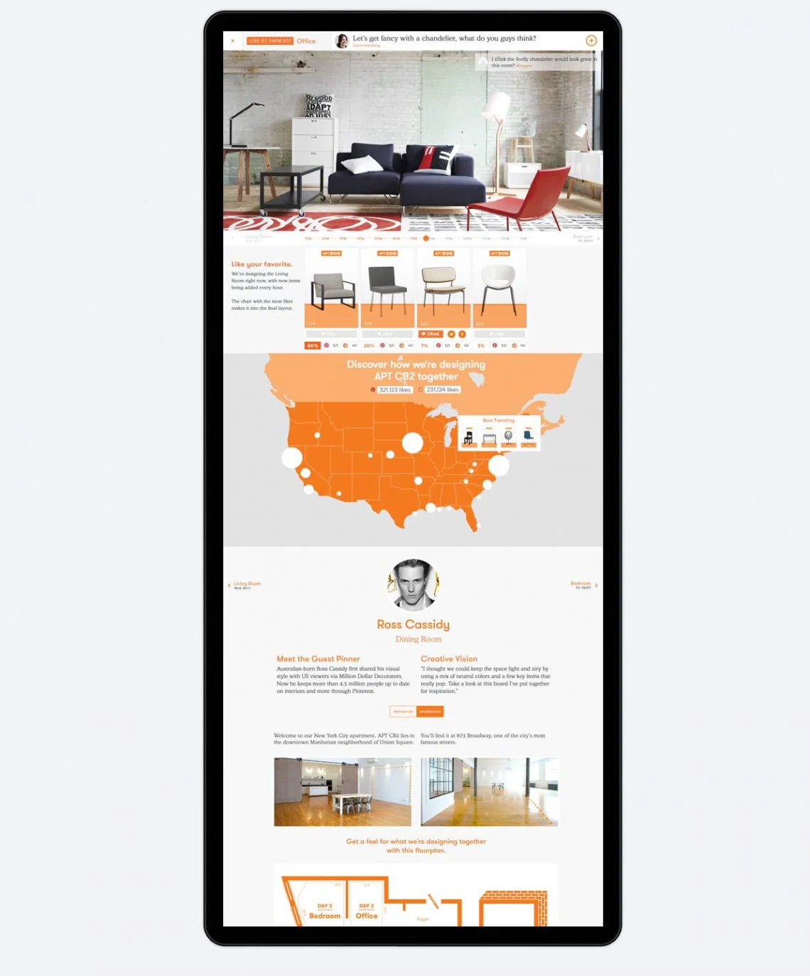
APT CB2 is the first real apartment designed live on Pinterest.
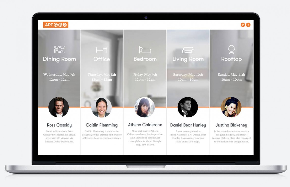
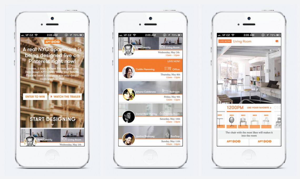
To broaden its fanbase, CB2, a modern furniture store, crowdsourced the live design of a Manhattan apartment using Pinterest. CB2 enlisted five popular Pinterest designers to style the empty space by selecting and “pinning” items from its store to the campaign’s board. Each designer worked a different room, and helped to select its content by voting for their favorite items. After voting, users could also enter a sweepstakes via Twitter or an online entry form to win their dream room worth $5,000.
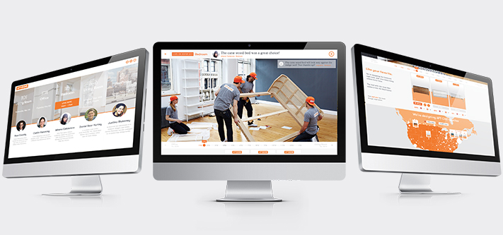
Kicking off on May 7, 2014, the apartment was designed in real time. Designers were assigned a specific day, and for twelve hours that day, users voted on the designer’s top picks, either on the campaign’s microsite or on Pinterest. The winning items were featured in “APT CB2” for the week of the campaign and were revealed on the microsite. The campaign was promoted through a YouTube trailer, which could be shared on Facebook, Twitter and Instagram. The microsite was built with HTML5, and following the completion of the campaign, it showcased the design process from start to finish using time-lapse photography.
Objectives
Design a desktop and mobile site to allow users to vote on their favorite items every hour throughout the 5-day campaign. The site should clearly distinguish the different rooms on different days, so the users would know what room is currently being designed live. There will be a timeline to control the image sequence feed and it has to be intuitive enough for the users to know how to interact with it and scrub through the day and see how the room was designed piece by piece.
Responsibilities
Designed the user experience and user interactions for the desktop and mobile site.
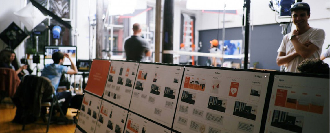
Wireframed the design to establish a common understanding between designers, developers and the clients.
Made sure that navigation, voting and timeline scrubbing is simple to understand.
Provided recommendations to solve problems with very wide screens that do not display necessary elements on one screen.
Design Considerations
Pan device sideways to view room on mobile
In order to fit the image of the whole room into a portrait view of a mobile device, and not make it too small in favor of maintaining the aspect ratio, I decided to have the image extend beyond the width of the screen, and using the accelerometer and gyroscope in the device, allow the users to pan their devices sideways to view the whole room.
Screens with low viewport height
There were concerns about some screens with low viewport height that will not be able to display the whole image for the image feed without altering the aspect ratio. I recommended 2 solutions to tackle that problem as detailed in the last 2 pages of the wireframes.